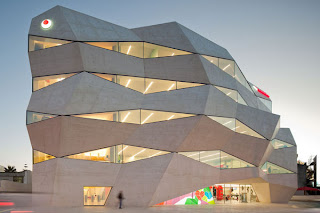
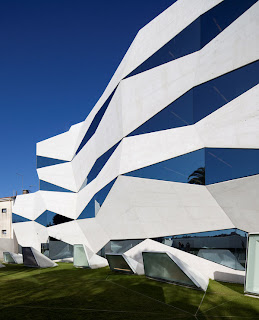
This is another example of architecture in motion. This is the famous Vodafone headquarters building in Portugal. You can see by the way the lines of the building moves from left to right giving the viewer a sense of movement throughout the structure. This is known as implied movement. The building itself is balanced and not moving at all, but to the viewer it looks like it could be moving from left to right. Implied movement is becoming popular in architecture, it really makes the building pop out at you. It almost looks like the building is falling down on the right side, but in reality the structure is sound. The structure uses direction to imply a crumbly movement from left to right. This is another amazing structure that shows the viewer implied motion through architecture.
Thursday, June 30, 2011
Movement and Motion
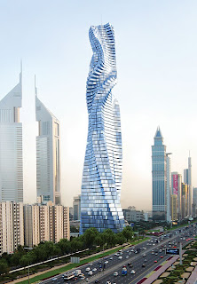
Here is an example of architecture in motion. You can see that the building itself is not moving but it gives the visual perception of it being in motion. This type of motion is called implied motion. You can see that the lines of this structure gives you the feeling that the building will keep moving in that direction as you look up at it. It looks to the viewer as if this structure is spinning in place from right to left. The overall shape is balanced yet it gives you a visual sensation that it is not balanced. The curves of this building makes it look like its turning counter-clockwise at the base, then changes directions midway through to look like its turning clockwise. The building conveys the energy of movement through the overall design. This abstract building is a great example of implied motion.
Tuesday, June 28, 2011
Tone and Color
Tone and Color
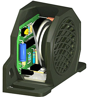
A. This is an example of a 3D model of a alarm speaker system. You can see that the tonal aspects of this design gives the look a 3D experience. The tone interacts with the different dimension sizes to create this 3D image and also gives the different parts depth. Without the tone we would not be able to view this as a 3D image, it would fall flat and create more of a 2D effect.
B. The tone is working closely with texture. The texture gives each of the different items a new feel to the viewer. You can see that each of the different items has a very different texture, this also helps create the 3D look and feel of this design. You need the look of the different textures in this design to really get a feel for what you are looking at, it really makes the image pop out at you.
C. The color aspect of this design is vital for the viewer. It helps give a dimensional look to this 3D design. The shading of the colors helps us to understand what components are bigger, smaller, and most important. The color also helps to see what the final result of the product is going to look like. Through the use of our cones we can clearly see the difference in colors being presented. This helps us understand exactly what we are looking at. The colors really help us understand which components will go where they need to go.
D. Color also helps with the different shapes we see in this image. We are able to clearly see the different shapes through the shading of the colors. This is important so you can clearly visualize where each component will be located in the system. It also works closely with dots and lines to create this image. The dots and lines work in unison with the color scheme to help create this 3D design. You need the dots and lines to create the shape, and you need the color to really get a pop out effect of each item.
Saturday, June 25, 2011
Packaging Design 2D and 3D
Lines
Here we have an example of how lines work in package design. The top picture is of the 2D model of what this package is suppose to look like. It uses lines and dots to create a 2d image of what the design looks like before it is folded together. The dots on the 2D image connect the lines, splines, ellipses, circles, and curves. This make it easier to find a reference point in the design. Without the dots it would be impossible to be able to create any type of circle spline or ellipse. The pink lines show where the folds or crease will be in design while the black lines are where the machine will cut the design. It is important in a cad file to have both lines and dots to really be able to see and find how the package will come together. The second picture is what the design looks when its cut and folded correctly. We will next look at shape in 3D cad design.
Shape
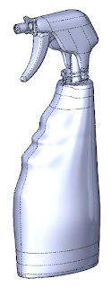
Here we have a 3D image of a spray bottle. You can see that the lines and dots work together to give this image shape. The dots control where the lines go and the lines describe the contours of the shape. This design uses all three basic shape patterns such as circles, square and triangle to form this design. Without these basic patterns this design would not have the shape in 3D. These types of patterns are crucial when it comes to 3D cad design without them the program would fall flat. It is necessary for these shape patterns otherwise this would be a basic 2D cad drawing, it's because of the shapes that we are able to view this in a 3D environment. We will next be looking at textures and tone.
Texture and Tone
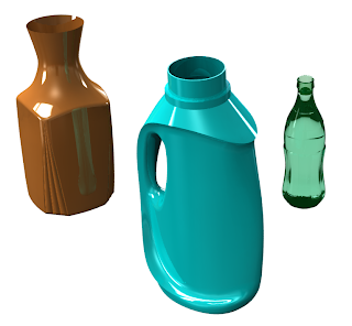
In this image of the three bottles we get a lot of mix and match of tone and texture. The simulated texture of these bottles give the illusion of the them being 3D. The texture makes the bottles jump out at you while relieving flatness to the image. The texture gradient creates depth to these bottles giving them the 3D look. It gives the viewer an idea of what these items will look and feel like when they are produced in the real world. There is a lot of detail through texture to make the design seem more real. You can see the use of tone around the dark edges of these 3D drawings, this gives the shapes depth and makes it easier for the viewer to understand what they are looking at. The tone also helps to see the position in space of these objects by the refection and shadows. The tone also interacts with the colors of these objects.
Tuesday, June 21, 2011
Design Success and Failure in Relation to Syntactical Guidelines
Design Success
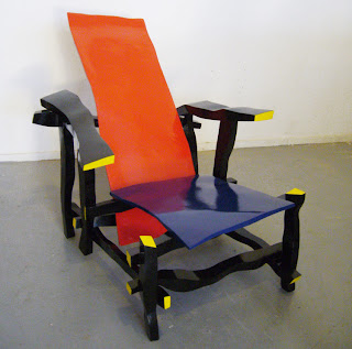
In this image we see a chair design that fails in relation to syntactical guidelines. The first problem is the visual perception, the odd color schemes and funky looking shapes of this chair. It is not appealing to look at, and it also looks very uncomfortable to sit in. The colors chosen for this design are very bizarre and give off an unappealing visual. This design is visually not balanced, it gives off an a look that is visually awkward. The designer was going for a dynamic stressed look but it comes out unappealing and creates tension to the viewer. The designer was also going for a sharpening effect but in this case it's just too much visually for the viewer, the chair grabs your attention in all the wrong ways. It makes this chair look incredibly uncomfortable and visually ugly. It is for these reasons that this design is a failure to syntactical guidelines.
Sunday, June 19, 2011
Visual Thinking Research
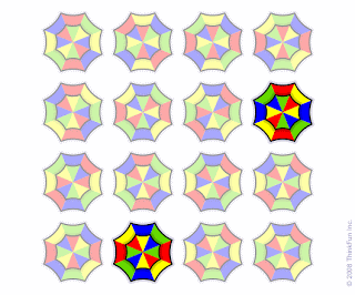
In this image you have to find the two umbrellas that are the same. You can rotate them but not mirror them. This exercise took me quite a while to figure out, again used the process of elimination to pinpoint the two correct images. Once again I started out using the finding technique. I thought I could just stare at the image long enough and it would just pop out at me. When that didn't work I started using the long matching technique to weed out the umbrellas I knew were not going to work. Every time i thought I had a match i would find something out of place. It wasn't until I started rotating the images that I was able to discover which two they were.
This puzzle also stumped my wife for a long time. After a while she had to put it down and wait a few minutes before attempting it again. She finally found the two by a process of elimination. She also used the finding technique thinking that if she looked hard enough the solution would present itself. She then used the categorizing technique to find common features between the two correct umbrellas. I eventually let her know that you need to rotate the image in your head to really discover the two that are matching. The first time she guessed she was incorrect, but on the second attempt she finally got it. I found it interesting she was able to find the solution for the first puzzle right away but the second puzzle stumped her.
Tuesday, June 14, 2011
Top-Down Visual Processing
Top Down Processing
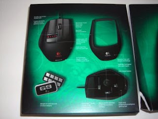
This is an example of a mouse package I designed for a company called Logitech. There are many goal based objectives to this package. The first short fixation we have with this package is on the mouse itself. We are fixated on the actual item in the package to see if it's a product we want or need. Some of the just in time queries you might have about this product would be what type of mouse this is. For example is this a gaming mouse or an everyday mouse, is it wireless or does it have a cord, does this mouse work with my windows system. These are all things we would find on the bottom part of this package. The process of scan paths would have us first looking at the product, then the graphics and finally turning the package over to get more information on the back of the box.
You can see when the box is turned over there are many more fixations and look-aheads. We would fixate at the graphics on the back of the box to find out if this looks like a mouse we would enjoy using. We would look ahead to see if this is a mouse we could use everyday comfortably, we might also be looking at the price tag to find out if we can afford this mouse. This takes us to the next step of eye tracking to store and track these types of scan paths and fixations. This is so we can remember this item and determine if it is really a product that we want or need.
Thursday, June 9, 2011
Interactions between the 3 levels
1. Representation
2. Abstraction
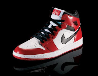
This is a pair of Nike Air Jordan's. It is a functioning basketball shoe that is an abstract of Michael Jordan himself. This shoe communicates to the buyer that if he buys these shoes will be able to run faster and jump higher. These shoes are a huge impact in the basketball word, every child that wants to grow up to be a professional basketball player gets a pair of Jordan's. You can find these shoes all over the world, and most people understand that the shoe can represent the player. This shoe can also move into the symbolic phase by denoting the player himself.
3. Symbolic
This is the logo for the Air Jordan Brand. It is an abstract photo that denotes the player himself through the way he looks when he is slam dunking. This is a world wide seen logo that shows the Michael's silhouette going up for a slam dunk. It is an american name brand logo that can also be a representation through things like shirts, shorts, and shoes.
Meaning in Design
1. Representation
This picture is a representation photo of a 747 jet. More specifically this is a Dragonair Cargo jet that transfers cargo all across the world. You can tell this photo is representational because of the large amount of detail in the photo. This photo was captured this year at the San Francisco
2. Abstraction
This is a picture of an airplane that is reduced to the basic elements of what a plane is. This makes the picture an abstract drawing of what a plane really is. This is a function based abstraction because it looks like what it does. It gives the basic function of the plane by showing the shape of the fuselage, the wings, and the jet engines. You can tell it’s not a representation because of the lack of detail on the drawing. It is a primitive sketch of what an airplane looks like in flight thus making it an abstract drawing.
3. Symbol
This is a common sign that we see on the roads that signifies to the driver that there is an airport ahead. It is a graphical symbol that is common knowledge to our culture as well as many other cultures. For most countries this is the common symbol we see to find an airport. This symbol denotes a basic drawing of an airplane so it is easy for the viewer to understand what they are looking at. There maybe different types of variations of this symbol from county to country, but most of the signs look very similar. It is a common sign we use everyday that signifies a symbol.
Subscribe to:
Posts (Atom)
