Tone and Color
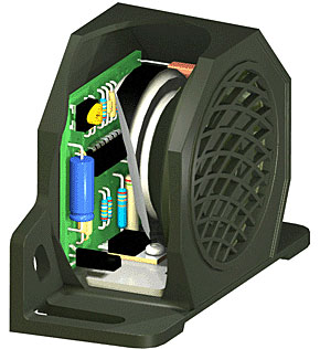
A. This is an example of a 3D model of a alarm speaker system. You can see that the tonal aspects of this design gives the look a 3D experience. The tone interacts with the different dimension sizes to create this 3D image and also gives the different parts depth. Without the tone we would not be able to view this as a 3D image, it would fall flat and create more of a 2D effect.
B. The tone is working closely with texture. The texture gives each of the different items a new feel to the viewer. You can see that each of the different items has a very different texture, this also helps create the 3D look and feel of this design. You need the look of the different textures in this design to really get a feel for what you are looking at, it really makes the image pop out at you.
C. The color aspect of this design is vital for the viewer. It helps give a dimensional look to this 3D design. The shading of the colors helps us to understand what components are bigger, smaller, and most important. The color also helps to see what the final result of the product is going to look like. Through the use of our cones we can clearly see the difference in colors being presented. This helps us understand exactly what we are looking at. The colors really help us understand which components will go where they need to go.
D. Color also helps with the different shapes we see in this image. We are able to clearly see the different shapes through the shading of the colors. This is important so you can clearly visualize where each component will be located in the system. It also works closely with dots and lines to create this image. The dots and lines work in unison with the color scheme to help create this 3D design. You need the dots and lines to create the shape, and you need the color to really get a pop out effect of each item.

No comments:
Post a Comment